THE STORY BEHIND THE MYTHOLOGIE LOGO
THE STORY BEHIND THE MYTHOLOGIE LOGO
When I knew I was absolutely going to move forward with building a candle company, the first "business-y" thing I did was call my go-to designer about the logo. Her name is Kristen of Moonwalker Digital.
It's funny how relationships develop. She started as one of my music marketing students a few years ago and approached me about building a professional website. We get a lot of offers over at my company Savvy Musician Academy, but she really stuck out to me as I looked at her portfolio and was really impressed!
And something about her just really drew me to her. So we had our first meeting I knew we would really gel as people and realized we had some cool things in common, especially since she's also a singer/songwriter and creative in many ways.
Even though Kristen does a lot of more corporate-style work, she's been brave enough to also tackle some of my Celtic-fantasy digital media for my music. She and her team worked on my music website, my 30-minute documentary for The Quest album, and many different video clips, graphics and more for the last couple of album promotions.
So naturally, when I went to build this candle brand I had to go straight to her. What I had in mind wasn't exactly a piece of cake, and would probably be challenging for any designer, and yet she came to me with several awesome prototype options. We really worked together for several weeks before finally landing on what we now have!
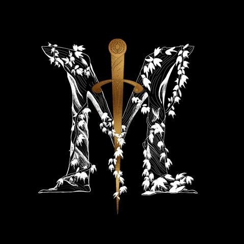
The idea behind this logo is that the M is actually made out of wood. If you look up close you see all the details of chiseled and aged grains of wood. Wrapped around that monogram is ivy, which instantly transports you to a mood that's more mysterious.
Where might you be where ivy has overgrown and covered trees or ancient ruins?
And then, in the middle of this ivy-covered wooden M you have a golden sword piercing through the center, bolding proclaiming victory.
Why the sword? I wanted a reminder of times of old when chivalry, manners, and triumphing over enemies prevailed. It creates a clear posture.
Without the sword, we have a very pretty monogram. But with the sword, we have an emblem! It's also more memorable.
Who knows, we may refine it as time goes on, but for the beginning of a brand, I'm pretty excited with what we have so far!
What say you?


Leave a comment